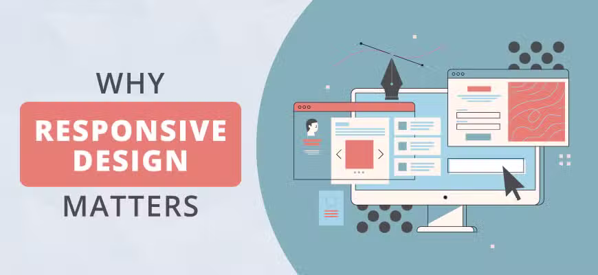
Why Responsive Web Design Matters?
Within the last six years, the share of global internet usage on smartphones versus computers has jumped from just 16.2% to over 53% resulting to a paid attention on responsive web design. A number of factors contribute to this phenomenon. This includes consumers in emerging markets skipping personal computers altogether and going straight to smartphones.
So what does all this mean for your digital marketing strategy? It means that your customers are more likely than not to view your website on a mobile device than on a computer. Making sure your website looks just as good and works just as well on a smartphone is crucial!
What is Responsive Web Design?
Responsive web design is industry terminology for a site that renders well across all digital platforms from personal computers to tablets to smartphones. If a website is responsive, the layout automatically adjusts for the size of the screen. Certain menus and appearances also may adjust depending on the medium.
Some of the things a responsive website will do automatically include adjusting font sizes to avoid zooming, ample spacing for touch screen tapping and formatting menus to remove the need for horizontal scrolling.
The idea of responsive web design is to write it once and run it everywhere. There shouldn’t be a need to create multiple sites. A responsive site is fluid and content management is centralized.
The only downside of a responsive site is that everything is tied to your main site. If your main site is down, your mobile site will also be down. Depending on how you’re building your site, mobile styling can also take time but generally building a responsive website is more cost and resource effective than other options.
Website Design on WordPress
Luckily for you, you don’t have to be a coding guru to create a beautiful responsive website. User friendly hosting sites like WordPress offer themes responsive designs that automatically update the CSS style sheet as it recognizes different devices. Other top hosting sites such as Squarespace and Weebly offer responsive templates so you can hit the ground running. Take note also that most website design company nowadays uses WordPress. In addition to that, you could search online and find WordPress website design portfolio to help you out.
Responsive Sites for SEO
Can you remember a time when you viewed a website on your phone where you had to pinch everything to zoom in or out just to navigate? It’s a very suboptimal user experience. A reported 40% of users will go to a competitor’s website due to a poor mobile experience.
Google doesn’t treat websites like this kindly when it comes to page ranking. In 2015, Google rolled out an algorithm to factor mobile usage into website rankings. So along with keywords, great content and domain expertise, modern SEO strategy also requires responsive web design.
If you don’t know whether your site is mobile friendly or not, Google offers a simple test to check. Simply paste your URL into the tool and view the details of your mobile friendliness ranking. If your site needs work in the mobile friendliness department, partnering with a digital marketing agency to fix that may be a good strategic move.

At N2Q we employ experts on web design, SEO and branding that help to create blueprints for marketing success. We begin the process by scheduling a complimentary strategy session. We listen to your story, your goals and decide together if we’re a good fit.
By partnering with a small business digital marketing agency, you can focus more on the core aspects of your business while reaping the benefits of a well-positioned digital marketing portfolio.
Book your free strategy session or check out our favorite work.
Web Design No To The Quo
